Bar Chart
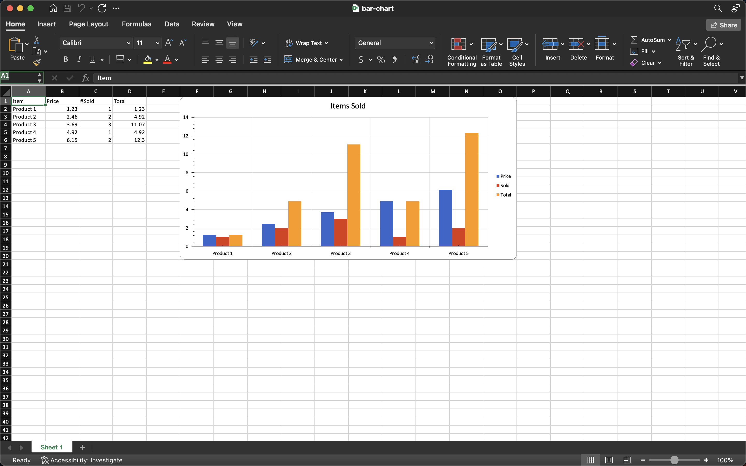
A bar chart compares values across categories that have no natural order: products, regions, months of the year treated as labels rather than as a timeline. Each series contributes one bar per category, so three series over five products gives fifteen bars grouped in fives.
AddBarChart returns a chart that draws vertical bars. Excel calls that a column
chart and reserves “bar” for the horizontal form, which is what SetDirection
switches between.
| Call | Result |
|---|---|
bc.SetDirection(crt.ST_BarDirCol) (default) | Vertical bars, categories along the bottom. |
bc.SetDirection(crt.ST_BarDirBar) | Horizontal bars, categories up the side. |
Horizontal bars are the better choice when the category labels are long enough to overlap each other along the bottom axis.
Adding the chart
dwng := ss.AddDrawing()
chart, anc := dwng.AddChart(spreadsheet.AnchorTypeTwoCell)
anc.SetWidthCells(10)

bc := chart.AddBarChart()
priceSeries := bc.AddSeries()
priceSeries.SetText("Price")
priceSeries.CategoryAxis().SetLabelReference(`'Sheet 1'!A2:A6`)
priceSeries.Values().SetReference(`'Sheet 1'!B2:B6`)

soldSeries := bc.AddSeries()
soldSeries.SetText("Sold")
soldSeries.Values().SetReference(`'Sheet 1'!C2:C6`)
Only the first series sets a category reference. The categories belong to the chart rather than to a series, so repeating the reference on every series is allowed but redundant.
A bar chart needs both axes before it will open cleanly. Create them on the chart, attach them to the plot, and cross them:
ca := chart.AddCategoryAxis()
va := chart.AddValueAxis()
bc.AddAxis(ca)
bc.AddAxis(va)
ca.SetCrosses(va)
va.SetCrosses(ca)
Series colors come from a fixed twenty-color palette, applied by series index and
wrapping around after the twentieth. Properties().SetSolidFill() overrides the
one you were given.
Limitations
Grouping has no setter. AddBarChart fixes it at ST_BarGroupingStandard, and
the other three values (ST_BarGroupingClustered, ST_BarGroupingStacked and
ST_BarGroupingPercentStacked) are reachable only through the wrapped XML:
bc.X().Grouping.ValAttr = crt.ST_BarGroupingStacked.
BarChartSeries has no Marker() or Labels(), so per-point data labels are
not available on a bar chart the way they are on line and scatter series.
Nothing checks that the ranges on different series are the same length. A series pointing at a shorter range simply produces fewer bars in its group.
Run the example
The example writes a small product table, then charts price, quantity and total as three series against the product names.
git clone https://github.com/unidoc/unioffice-examples.git
cd unioffice-examples/spreadsheet/bar-chart
go run main.go
If this is your first time using UniOffice, follow the getting started guide to create an API key and set up your development environment.
View the full source
Sample output