Bubble Chart
A bubble chart carries three numbers per point instead of two. The category and value place the bubble; the third number sizes it. That extra dimension is the whole reason to choose one: revenue against margin with headcount as the bubble size says something a two-axis chart cannot.
The data shape is one range more than every other chart type in this group.
BubbleChartSeries exposes BubbleSizes() alongside Values(), and both are
NumberDataSource, so both take either a cell reference or literal values.
Adding the chart
dwng := ss.AddDrawing()
chart, anc := dwng.AddChart(spreadsheet.AnchorTypeTwoCell)
anc.SetWidthCells(10)

bc := chart.AddBubbleChart()
soldSeries := bc.AddSeries()
soldSeries.SetText("Sold")
soldSeries.CategoryAxis().SetLabelReference(`'Sheet 1'!A2:A6`)
soldSeries.Values().SetReference(`'Sheet 1'!C2:C6`)
soldSeries.BubbleSizes().SetReference(`'Sheet 1'!D2:D6`)
All three ranges should cover the same rows. Nothing enforces it, and a size range shorter than the value range leaves the trailing points with no size of their own.
The chart takes the usual category and value axes, attached with bc.AddAxis and
crossed against each other, then sheet.SetDrawing(dwng) puts the drawing on the
sheet.
Limitations
BubbleChart.InitializeDefaults is empty. Every other chart type sets something
up when it is created, so a bubble chart starts with less configured than its
neighbors, and things like a legend have to be added explicitly.
BubbleChartSeries has no Marker() or Labels(). There is no way through the
wrapper to label a bubble with its size value, which is the most common request
for this chart type.
Bubble sizes are absolute numbers, not scaled to a range. A size column whose values differ by two orders of magnitude produces one bubble that swallows the plot area and a handful that are close to invisible.
Run the example
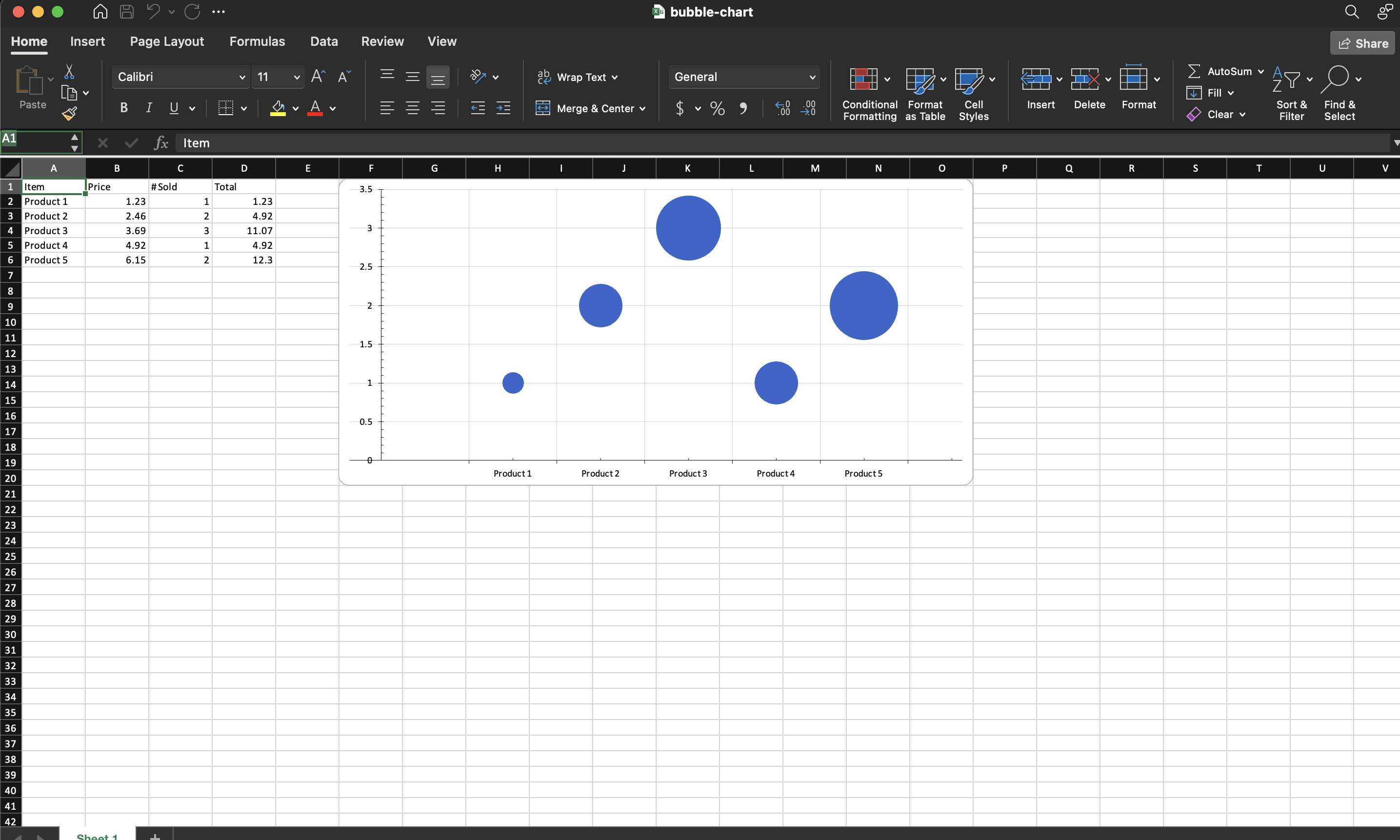
The example charts the quantity sold column with the total column as the bubble size, giving five bubbles over the five product categories.
git clone https://github.com/unidoc/unioffice-examples.git
cd unioffice-examples/spreadsheet/bubble-chart
go run main.go
If this is your first time using UniOffice, follow the getting started guide to create an API key and set up your development environment.
View the full source
Sample output