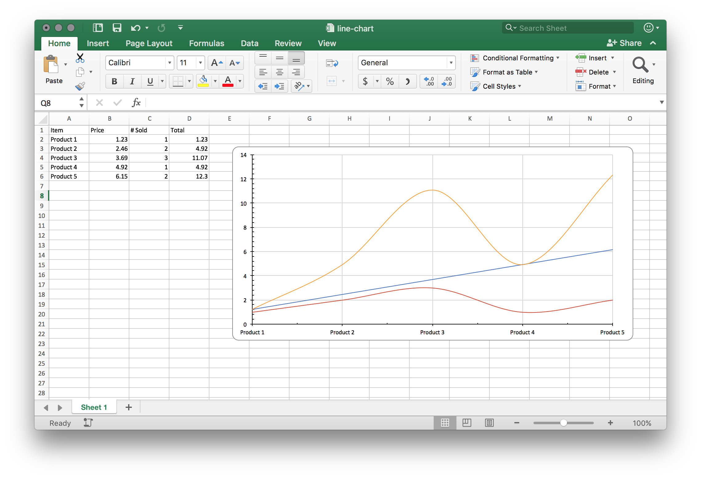
Line Chart
A line chart connects the points of each series in the order the category axis gives them, which makes it the right choice whenever that order carries meaning: dates, versions, measurement steps. Where the categories are unordered labels, a bar chart reads better, because a line between two unrelated categories implies a trend that is not there.
The data shape is one label range for the categories and one numeric range per series, all the same length.
Adding the chart
dwng := ss.AddDrawing()
chart, anc := dwng.AddChart(spreadsheet.AnchorTypeTwoCell)
anc.SetWidthCells(10)

lc := chart.AddLineChart()
priceSeries := lc.AddSeries()
priceSeries.SetText("Price")
priceSeries.CategoryAxis().SetLabelReference(`'Sheet 1'!A2:A6`)
priceSeries.Values().SetReference(`'Sheet 1'!B2:B6`)

soldSeries := lc.AddSeries()
soldSeries.SetText("Sold")
soldSeries.Values().SetReference(`'Sheet 1'!C2:C6`)
The category reference goes on the first series only. Later series inherit the same categories, so they need nothing but a value range and a name.
The chart still needs its axes attached and crossed, and the drawing still has to
be attached to the sheet with sheet.SetDrawing(dwng). Neither happens
implicitly.
ca := chart.AddCategoryAxis()
va := chart.AddValueAxis()
lc.AddAxis(ca)
lc.AddAxis(va)
ca.SetCrosses(va)
va.SetCrosses(ca)
LineChartSeries carries three things the bar and radar series types do not:
| Call | Effect |
|---|---|
series.SetSmooth(true) | Draws a curve through the points instead of straight segments. |
series.Marker() | Symbol and size for the point markers, through SetSymbol and SetSize. |
series.Labels() | Per-point labels, with SetShowValue, SetShowCategoryName and friends. |
Limitations
Grouping is fixed at ST_GroupingStandard when the plot is created. Stacked and
percent-stacked lines require setting lc.X().Grouping.ValAttr directly.
A gap in the referenced range shows as a gap in the line. AddChart sets the
chart’s blank handling to ST_DispBlanksAsGap, and SetDisplayBlanksAs on the
chart changes it if you would rather the line span the missing point or drop to
zero.
Series colors are assigned from a fixed twenty-color palette by series index, so the twenty-first series repeats the first color.
Run the example
The example builds a five-row product table and charts price, quantity sold and total against the product names.
git clone https://github.com/unidoc/unioffice-examples.git
cd unioffice-examples/spreadsheet/line-chart
go run main.go
If this is your first time using UniOffice, follow the getting started guide to create an API key and set up your development environment.
View the full source
Sample output