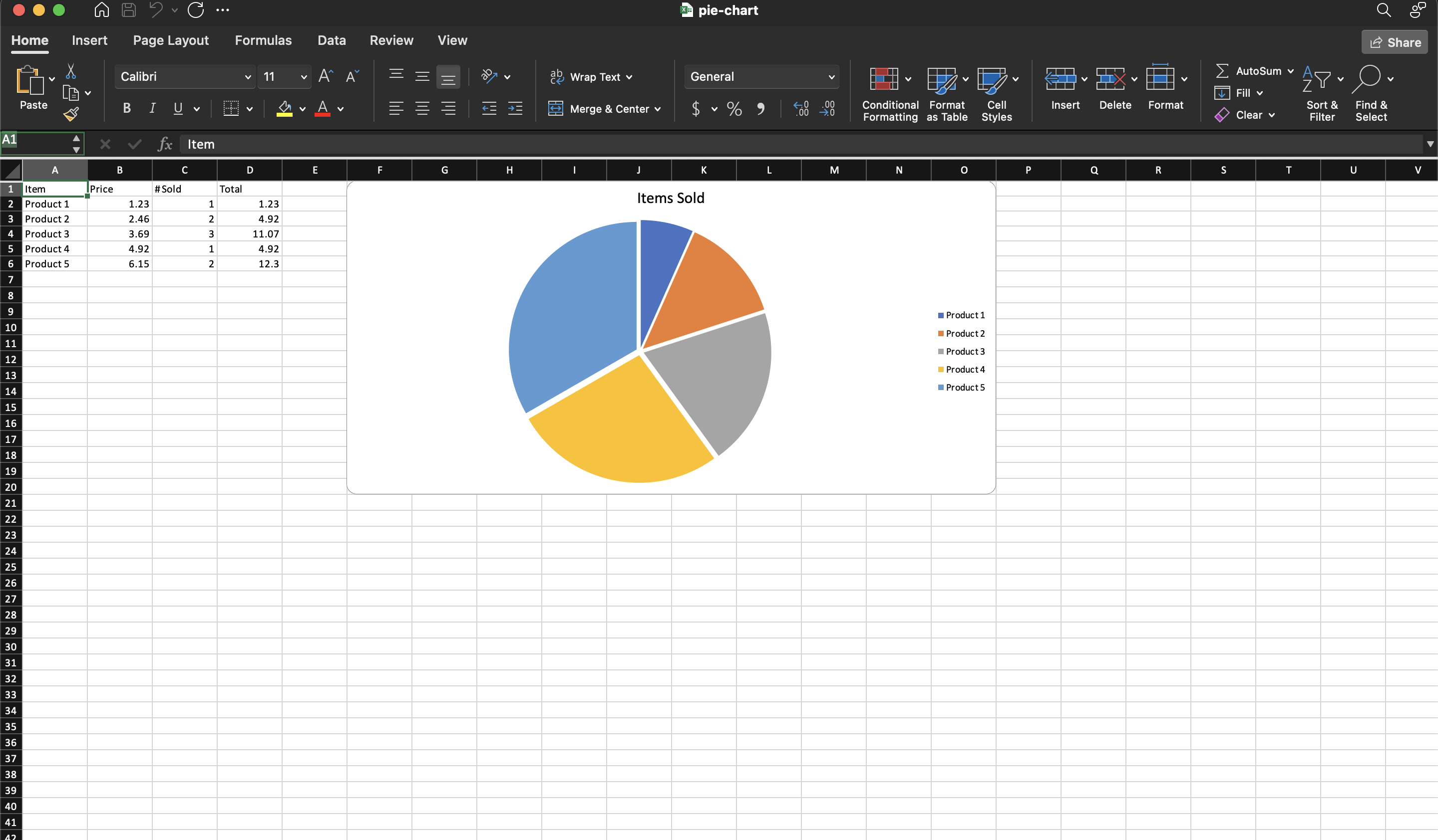
Pie Chart
A pie chart shows how one set of numbers divides a whole. That constrains the data more than any other chart type here: one series, all values positive, and a total that means something. Revenue by region is a pie; revenue by region over five years is not.
Pie charts are also the one family with no axes. PieChart, Pie3DChart,
PieOfPieChart and DoughnutChart have no AddAxis method, because there is
nothing to measure along. Everything the reader needs comes from the legend and
the labels.
Adding the chart
dwng := ss.AddDrawing()
chart, anc := dwng.AddChart(spreadsheet.AnchorTypeTwoCell)
anc.SetWidthCells(10)

pc := chart.AddPieChart()
priceSeries := pc.AddSeries()
priceSeries.SetText("Price")
priceSeries.CategoryAxis().SetLabelReference(`'Sheet 1'!A2:A6`)
priceSeries.Values().SetReference(`'Sheet 1'!B2:B6`)
priceSeries.SetExplosion(3)

chart.AddLegend()
sheet.SetDrawing(dwng)
SetExplosion moves every slice out from the center by the given amount. It is a
whole-series setting, so there is no way through this API to explode a single
slice and leave the rest in place.
Slice colors are handled differently from other chart types. AddPieChart turns
on varyColors, which tells Excel to color each data point separately rather
than coloring the series as a unit, so a pie comes out multicolored without any
palette code.
Because there are no axes, a legend matters more here than elsewhere. Without
chart.AddLegend() the slices have no labels at all.
Related constructors
| Constructor | Shape |
|---|---|
AddPieChart() | Flat pie. |
AddPie3DChart() | Pie drawn with the 3D view applied. |
AddDoughnutChart() | Pie with a hole in the center, 50 percent by default and adjustable with SetHoleSize. |
AddPieOfPieChart() | Pie with a second plot beside it, either a pie or a bar depending on SetType. |
All four take PieChartSeries, so switching between them is a one-line change.
Limitations
SetExplosion takes a uint32 and there is no matching getter, so the value can
be set but not read back.
PieChartSeries has no Marker() or Labels(). Percentage labels on the slices
are not reachable through the series wrapper.
Run the example
The example charts the price column of a five-product table as a single exploded pie, with the product names as the categories.
git clone https://github.com/unidoc/unioffice-examples.git
cd unioffice-examples/spreadsheet/pie-chart
go run main.go
If this is your first time using UniOffice, follow the getting started guide to create an API key and set up your development environment.
View the full source
Sample output