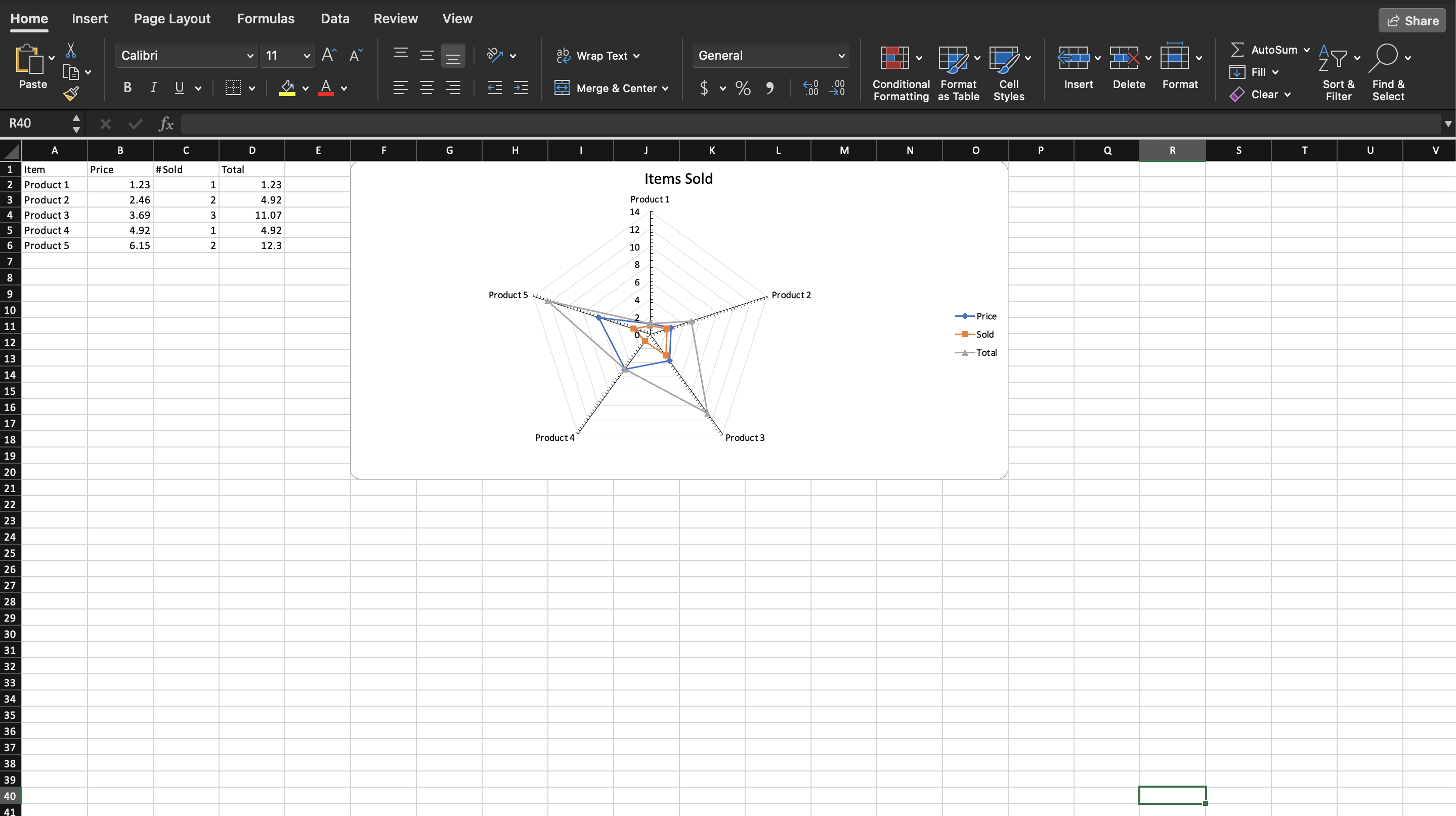
Radar Chart
A radar chart wraps the category axis into a circle and draws each series as a closed shape around it. It answers a shape question rather than a value question: which series is strong where, and where they differ in profile. Skill assessments, product feature scoring and survey results are the usual cases.
It needs at least three categories to enclose an area, and it wants the series to be on comparable scales. Plotting a price of 1.23 against a count of 5 on one radar makes the smaller series collapse toward the center.
Adding the chart
dwng := ss.AddDrawing()
chart, anc := dwng.AddChart(spreadsheet.AnchorTypeTwoCell)
anc.SetWidthCells(10)

rc := chart.AddRadarChart()
priceSeries := rc.AddSeries()
priceSeries.SetText("Price")
priceSeries.CategoryAxis().SetLabelReference(`'Sheet 1'!A2:A6`)
priceSeries.Values().SetReference(`'Sheet 1'!B2:B6`)

soldSeries := rc.AddSeries()
soldSeries.SetText("Sold")
soldSeries.CategoryAxis().SetLabelReference(`'Sheet 1'!A2:A6`)
soldSeries.Values().SetReference(`'Sheet 1'!C2:C6`)
The example repeats the category reference on every series. That is not required here any more than on a line chart, and setting it once on the first series produces the same result.
A radar chart still takes the ordinary pair of axes, attached and crossed:
ca := chart.AddCategoryAxis()
va := chart.AddValueAxis()
rc.AddAxis(ca)
rc.AddAxis(va)
ca.SetCrosses(va)
va.SetCrosses(ca)
Limitations
The radar style is fixed at creation. AddRadarChart sets
ST_RadarStyleMarker, which draws lines with point markers, and there is no
exported setter for the other two styles. Reaching them means writing to the
wrapped XML:
rc.X().RadarStyle.ValAttr = crt.ST_RadarStyleFilledST_RadarStyleStandard drops the markers and ST_RadarStyleFilled shades the
area inside each series, which is worth switching to for one or two series and
worth avoiding for four, since the fills obscure each other.
RadarChartSeries has no Marker() accessor, so the marker symbol and size that
the default style relies on cannot be changed through the wrapper either.
Run the example
The example charts price, quantity sold and total for five products, giving three overlapping shapes on one radar.
git clone https://github.com/unidoc/unioffice-examples.git
cd unioffice-examples/spreadsheet/radar-chart
go run main.go
If this is your first time using UniOffice, follow the getting started guide to create an API key and set up your development environment.
View the full source
Sample output